

If you run a Culver City business, your website should help busy customers quickly see what you do, who you help, and why they should choose you. You need clear messaging, easy tap-to-call contact options, and a mobile-first layout that makes it simple to act fast. When your site removes friction and puts one strong next step in front of visitors, it starts turning local traffic into real leads.
Main Points
- Clear value messaging helps Culver City customers instantly understand what you do, who you help, and why choose you.
- Every key page should have one clear CTA, such as call, text, quote request, or booking.
- Fast contact paths like visible phone numbers, short forms, and tap-to-call buttons help busy visitors act quickly.
- Mobile-first design with large buttons, readable text, and touch-friendly forms makes contact easy on phones.
- Simple navigation and reduced friction help turn more Culver City visitors into leads, appointments, and customers.
How a Culver City Website Helps Busy Customers
When you’re juggling work, errands, and family, a well-built Culver City website helps you get answers fast. You can check hours, services, location, and contact details without calling or waiting. That saves time and reduces friction when you need help now.
A smart site lets you move quickly from question to action, whether you want a quote, an appointment, or directions. You don’t waste effort hunting through confusing pages or outdated posts. Instead, you get clear paths that match how busy customers think.
On your phone, that matters even more. A fast, accessible website keeps you connected on the go and helps you make decisions with confidence. For your business, that means fewer missed opportunities and more customers reaching out.
Why Clear Messaging Beats Fancy Design
You win more customers when your site explains your value fast and clearly. Make contact paths easy to spot, so people can call, click, or message you without hunting.
Keep navigation simple, and you’ll help visitors act instead of getting distracted by flashy design.
Clear Value Proposition
Clarity wins customers faster than clever visuals ever will. When you state exactly what you do, who you help, and why you’re the right choice, visitors decide faster.
You don’t need vague slogans or bloated copy that makes them work to understand you. You need a value proposition that answers their real question: “Why should I choose you?” Keep it simple, specific, and benefit-driven. Show the result customers get, the problem you solve, and what makes your offer different.
When your message is clear, people feel confident staying on your site and learning more. That confidence turns into trust, and trust turns into action.
If your website speaks plainly, busy Culver City customers won’t hesitate. They’ll understand your value right away and move forward.
Fast Contact Paths
Fast contact paths help visitors act the moment they’re ready, instead of making them hunt for a phone number or form. You want every page to point straight to a call, text, email, or quote request.
When someone lands on your site, don’t make them guess what to do next. Put your contact options where their eyes naturally go, and use clear words that tell them exactly what happens when they click.
Fancy visuals won’t close the gap between interest and action. Clear messaging will.
If you’re easy to reach, you look responsive, trustworthy, and prepared. That’s what busy customers want. Give them a direct path, and you’ll turn curiosity into conversations faster. Keep the invitation obvious, and you’ll reduce friction without adding clutter.
Simple Navigation Wins
Simple navigation often matters more than flashy design because visitors want to find what they need without thinking twice. When you keep menus clear, you guide people straight to services, pricing, and contact details. That reduces frustration and builds trust fast. You don’t need extra clicks or clever labels that confuse busy customers. Simple paths help you convert more visitors because they can act while interest is high.
- Put your main pages in the top menu
- Use plain words that match customer intent
- Make every key action easy to spot
If your site feels easy, people stay longer and reach out sooner. Clear messaging wins because it saves time, lowers stress, and shows you respect your customers.
What Every Fast-Contact Website Needs
A fast-contact website should put your phone number, contact form, and key business details where visitors can spot them right away. You need a clear header, a visible call button, and a short form that works on phones. Keep your hours, address, and response time easy to scan.
| Element | Why It Matters | What You Should Do |
|---|---|---|
| Phone | Lets people call fast | Place it at the top |
| Form | Captures inquiries quickly | Ask only essentials |
| Hours | Sets expectations | Show them clearly |
| Address | Builds trust | Link to maps |
| CTA | Drives action | Use one strong prompt |
When you make contact effortless, you cut friction and earn more calls. Don’t hide anything behind extra clicks. Keep it simple, direct, and ready to use.
Put Your Services Front And Center
Show visitors what you do the moment they land on your site. Put your services front and center so people instantly know if you’re the right fit. Lead with clear service names, short benefit-driven descriptions, and a layout that guides the eye fast. Don’t bury your best offer under vague copy or deep menus.
Use simple sections that answer what you do, who you serve, and why it matters. That helps busy customers decide faster and feel confident taking the next step.
- Highlight your top services first
- Explain each service in plain language
- Use bold headings that scan quickly
When your services stand out immediately, visitors spend less time guessing and more time choosing you. That’s how you turn quick visits into real business.
Make Calling, Texting, And Messaging Easy
Once visitors know what you do, make it just as easy for them to reach you. Put your phone number where people can spot it fast, and make every contact option clear. Add tap-to-call buttons, simple text links, and a short message form that asks only for what you need.
When someone has a quick question, you don’t want friction slowing them down. You want them to call, text, or message without hunting around your site. Label each option plainly so they know exactly what happens next.
If you answer fast, say that. If you prefer texts for estimates, say that too. Clear contact choices build trust, shorten the path to action, and help busy customers choose you before they move on.
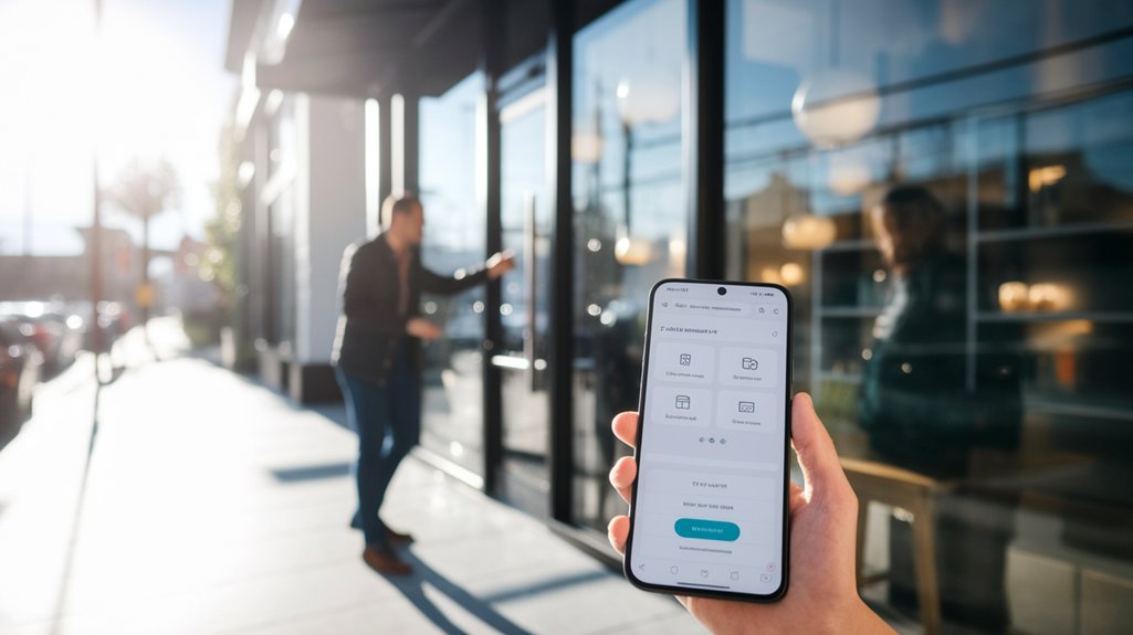
Build A Mobile Site For On-The-Go Visitors
Mobile visitors need a site that loads fast, reads easily, and works without pinching and zooming. When you build for phones first, you make it simple for people to find what they need while they’re driving, walking, or juggling errands. Use large buttons, short sections, and clean menus so every tap feels effortless.
Keep images light, trim extra code, and place key details near the top. Your site should help visitors act quickly, not force them to hunt.
- Show hours, services, and location right away
- Use readable fonts and strong contrast
- Make forms brief and touch-friendly
A mobile site gives you a sharper, smoother presence that matches how customers browse today.
Turn Website Visits Into More Local Leads
Make it easy for local visitors to contact you with clear buttons, simple forms, and visible phone numbers.
When you remove friction, you turn quick website visits into real leads faster. Add fast lead capture tools that let people reach out before they click away.
Clear Contact Paths
Clear contact paths help you turn website visits into local leads by making it easy for people to act right away. You should place your phone number, email, and address where visitors can spot them fast. Use one clear action on every page, like Call Now, Visit Us, or Request a Quote. Keep your contact info consistent across your site so people trust it.
When users don’t have to search, they’re more likely to reach out.
- Put contact details in the header and footer.
- Link buttons to the right page or phone line.
- Make directions and hours simple to find.
This removes friction and keeps interest from fading. For Culver City customers, clear paths mean less guessing and more real conversations.
Fast Lead Capture
Once visitors know how to reach you, the next step is capturing their interest before they leave. You need a fast lead capture system that makes it easy to act now. Use short forms, one clear offer, and a strong call to action on every key page. Ask only for the details you’ll use today, so people finish fast. Add instant quote requests, callback buttons, and booking links to turn clicks into conversations.
| Tool | Result |
|---|---|
| Short form | More completed leads |
| CTA button | Faster responses |
You also want mobile-friendly fields, because local visitors often browse on phones. When your website removes friction, you’ll collect more inquiries, move faster than competitors, and turn more Culver City visits into real customers.
Frequently Asked Questions
How Long Does It Take to Build a Local Business Website?
You can launch a basic local business website in 1–3 weeks, while custom sites usually take 4–8 weeks. You’ll move faster if you have content ready, clear goals, and quick feedback.
Can You Update My Website After It Launches?
Absolutely—you can update your website after launch, and it’ll be easier than moving mountains. You can add new services, change text, swap images, and keep your site fresh as your business grows.
Will My Website Include Search Engine Optimization?
Yes, your website can include SEO. You’ll get optimized titles, meta descriptions, headings, and content that help search engines find you faster, so more local customers can discover and contact you easily.
Do You Provide Website Hosting and Maintenance?
Yes—you’ll get secure hosting and ongoing maintenance, so your site stays fast, updated, and protected. You won’t wonder what’s next; we handle the details, while you focus on customers and growth.
Can You Add Online Booking or Payment Options?
Yes, you can add online booking and secure payment options, so customers can schedule or pay anytime. You’ll streamline sales, reduce back-and-forth, and make it easier for busy people to choose you quickly.
See The Next Post
If you want Culver City customers to act fast, you need a website that speaks clearly, loads quickly, and makes contact easy. You’ll win more leads when you show what you do, who you help, and why you’re the right choice. You’ll also convert more visitors when you keep navigation simple, calls to action focused, and mobile features front and center. Make it easy to understand, easy to trust, and easy to contact.


0 Comments